Behind the paper: EduBridge Analytica
How we built and tested EduBridge Analytica, what the 342 s to 45 s result means, and where a two-educator pilot stops.
Published in
Babcock University Journal of Education, Vol. 11, No. 1 (May/June 2026), pp. 223-239
Authors
Ahmed Mohamed (Carnegie Mellon University Africa) · Henry Chukwudi John (African Leadership University)
DOI
10.5281/zenodo.20712838
Access
Open access · CC BY 4.0 · double-blind peer review
In June 2026, the Babcock University Journal of Education published a study I co-authored with Henry Chukwudi John: "EduBridge Analytica: Bridging Theory and Practice in Educational Data Mining for Action Research." Educators using our workflow finished feature selection in 45 seconds on average, against 342 seconds by hand, while keeping 85-90% of the same features. Below: how we built and tested it, plus where a two-person pilot stops.
The gap the paper aims at
Educational data mining (EDM) builds computational methods for finding patterns in educational data. Learning analytics (LA) focuses on reading those patterns in context so teaching can change. Both fields are mature, and learning platforms produce more behavioural data than anyone can read. Educators who run action research on their own classrooms still see little of that work. Reviews by Kalita et al. (2025) and Kurday & Vladova (2025) keep reporting the same split: strong algorithms on one side, thin evidence about how teachers use the tools on the other.
Feature selection is a common sticking point. Before a dashboard or model, an educator has to prepare the data and decide which variables matter. That step often needs technical knowledge they do not have. Fadillah et al. (2025) treat it as a lasting problem for non-technical users of educational data. Automation can help, but an action researcher still has to understand and defend each choice.
Can a guided EDM and learning-analytics workflow help educators prepare data and pick features they can still explain for action research?
- See how the system helps educators upload datasets and check data quality before mapping onto a standardised schema.
- Test whether schema mapping helps educators find useful features in high-dimensional data without technical expertise.
- See how the performance, engagement, and course-insight dashboards help instructors read results for action research.
First a framework, then a prototype
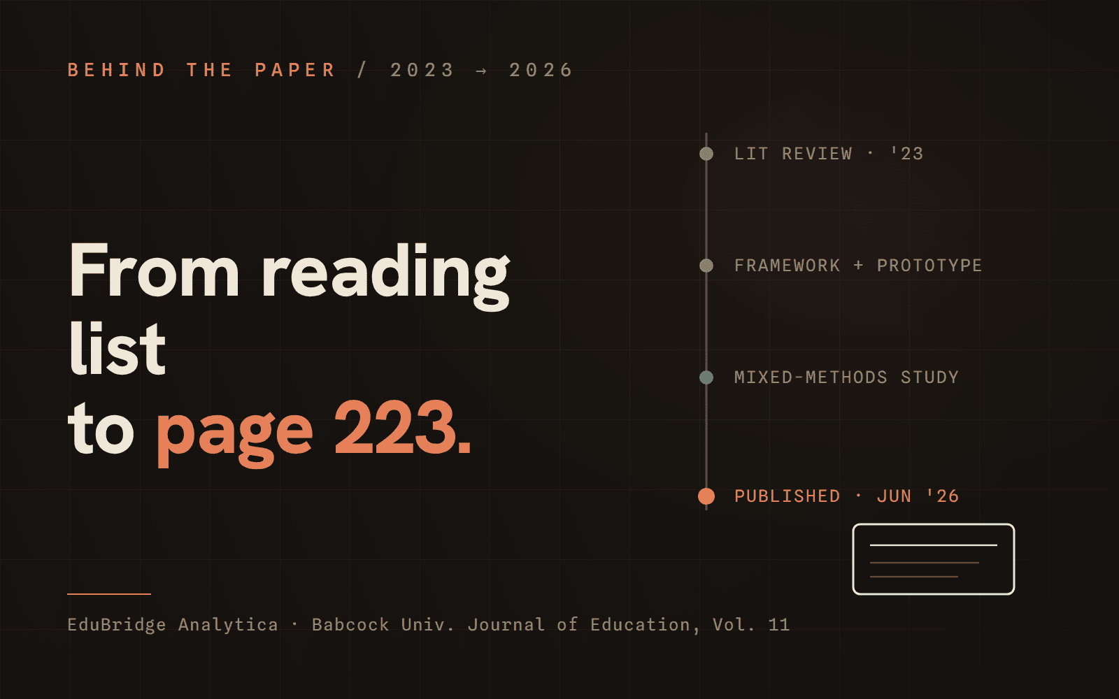
The project started with a 2023 literature review at African Leadership University. We built a framework that sorts analytical features on two axes: the perspective they describe (student, course, content, or instructor) and the source they come from (profiles, performance, or interactions). That gives educators a fixed map for the early stages of analysis.
EduBridge Analytica turns the framework into a web application. We went from low- and mid-fidelity Figma wireframes to a flow with sign-in, dataset upload, data-quality checks, schema mapping and guided feature selection. Dashboards cover performance and engagement, with course-content views as well. The app can suggest options and speed up the work, but the educator makes the decision.
The study: what we actually did
The evaluation was mixed-methods and deliberately small. Two educators, chosen for different levels of experience with technology-enhanced learning, each answered the same three action-research questions twice, first by hand, then with the prototype. We had no institutional dataset, so we built a synthetic post-secondary set informed by partner universities and sized to mirror real dimensionality. It spans six categories:
- Student information: IDs, gender, major, enrolment dates
- Course enrolment: courses, instructors, materials
- Instructor data: profiles, experience
- Course interactions: sessions, pages visited, clicks
- Assessment data: scores, submissions
- Student performance: GPA, improvement over time
STEP 01 · Brief
Orientation
Participants reviewed the dataset and tasks before starting.
STEP 02 · Manual
Feature selection by judgement alone
For each research question, the educator selected variables from the raw dataset with no system support. We recorded completion time and the selected feature set.
STEP 03 · Assisted
The same questions, through the prototype
The educator repeated the selection through the guided workflow: upload, quality preview, schema mapping, and supported selection. We recorded time and selected features again.
STEP 04 · Interview
Semi-structured debrief
Short interviews right after the tasks covered usability, cognitive effort, and confidence in the selections. Responses were analysed thematically.
Analysis rested on completion time and feature overlap between manual and assisted selections, with interview themes for experience.
Results, precisely
faster on average: 342 s manually to 45 s assisted
mean overlap with manual selection (85-90% across the three questions)
participating educators; this was a pilot, not a population
Manual selection averaged 342 seconds; the system-supported workflow averaged 45 seconds, an 87% drop. Overlap stayed high on every question: 90% on the first, 85% on the second, and 88% on the third. The time drop mattered because judgement stayed with the educators.
The interviews pointed the same way. Both educators described the assisted workflow as easier and less mentally demanding than the manual process, and both said the dashboards helped them connect selected features back to their research questions. Both also asked for more flexibility when moving between different kinds of questions. The paper reports that as a limitation, not a side note.
What the result adds
Teachers may have dozens of columns for clicks, grades, attendance, and submissions. Before analysing those records, they must decide which columns answer their classroom question. For educators without a data-science background, that early decision can stop the analysis before it starts.
In this pilot, the guided workflow cut that work from nearly six minutes to 45 seconds. It did so without much change to the selections: 85-90% of the assisted choices matched the educators' manual choices.
Research in this area often measures model accuracy, prediction, or visualisation. It measures the efficiency of data preparation and feature selection less often, even though those tasks can decide whether an educator reaches the later stages. Our study gives a direct, timed look at that early work with educators making the final decisions.
For example, an educator might ask whether early engagement predicts which students will struggle. A guided workflow can narrow a forty-column spreadsheet in a few minutes while keeping every choice visible for the educator to question and defend.
What the paper does not claim
- With n = 2, the numbers describe what happened in the room, not a population.
- The dataset is synthetic, built to mirror real post-secondary data, but not real institutional records.
- Every participant did the manual task first, so some of the speed-up may be familiarity with the dataset rather than the system; a counterbalanced design is the obvious next step.
- Time and overlap are proxies. Neither measures whether the eventual action research improved.
Future work, as the paper frames it, includes more participants and varied levels of system guidance, plus a closer look at the flexibility educators asked for across different question types.
Where it sits in the literature
The result fits a pattern in recent empirical work. In a randomised experiment with more than 8,000 MOOC participants, Borrella and Ponce-Cueto (2025) found that dashboards supporting interpretation improved learning outcomes, while purely descriptive visualisation added cognitive load for little gain. Wang et al. (2025) reached a similar place with teacher-facing self-service analytics: structured workflows reduce technical difficulty, but unaligned schemas and unguided feature relevance still confuse users. Lampropoulos and Evangelidis (2025) report that institutional adoption tracks whether a system helps people make sense of data in their own instructional context.
Taken together, practical impact seems to depend on putting analytics into workflows people can use and interpret. Our study adds a small data point at the feature-selection stage.
About the journal
The Department of Education and Humanities at Babcock University (Ilishan-Remo, Ogun State, Nigeria) publishes the Babcock University Journal of Education (BUJED). It releases two issues a year (May/June and November/December) and uses double-blind peer review. Articles are free to read under a Creative Commons Attribution 4.0 licence and receive DOIs through Zenodo. Indexes include Google Scholar, OpenAIRE, Zenodo, Dimensions and Garuda.
Our paper sits in Volume 11, Number 1 (May/June 2026), pages 223-239, published on 1 June 2026. The full text is free via the DOI at doi.org/10.5281/zenodo.20712838, on the journal's article page, or on ResearchGate.
Who did what
Author contributions, as declared in the paper: I handled conceptual design and the integrated framework, plus the prototype's logic/platform and the quantitative analysis. Henry Chukwudi John, my co-author at African Leadership University and the paper's corresponding author, led study design and the literature review. He also owned methodological structuring, qualitative analysis and manuscript drafting/revision. Isaac Museveni assisted with the critical evaluation of the text. We thank African Leadership University for supporting the research and the partner universities whose data informed the synthetic dataset. We also thank the two educators who gave us their time and candour.
The first reading list dates to 2023. The journal issue is May/June 2026. Henry carried much of the stretch between "it works" and "it is published", including review cycles and long waits between revisions.
I still use the principle behind the prototype in my work: software should handle repetitive tasks and show its work, while judgement stays with the person. The prototype and the results are on the work page. The seventeen-page paper is open access.